Defining components
Learn how to define reusable CMS components: file structure, required properties, and annotated examples covering building blocks, page sections, and nested composition with $ref.
A component is a reusable JSON Schema object that groups related fields — for example, a link, a banner, an SEO block, or a full page section. In a headless project, you declare each component in its own .jsonc file under cms/components/, merge them into a schema bundle with the Content plugin, and upload the bundle to the Schema Registry.
This guide covers how to define components, including file structure, required properties, and four annotated examples: a reusable building block, a page section, nested composition with $ref, and polymorphic fields.
For modeling concepts (Content Type vs. component, singleton patterns, recommended page structures), see Understanding content modeling and architecture for headless stores.
Before you begin
The Content plugin provides the CLI commands used in this guide to generate and upload your schema bundle. Make sure it's installed before proceeding by following the Content plugin guide.
Distinguishing components from Content Types
Both components and Content Types are JSON Schema objects, but they play different roles:
| Criteria | Component | Content Type |
|---|---|---|
| Purpose | Defines a reusable data shape or a page block to add to a page. | Defines a page template to create entries from. |
| Schema key | components | content-types |
| File prefix | cms_component__ | cms_content_type__ |
| Identifiers | $componentKey, $componentTitle | identifierKeys, $singleton |
| Referenced from pages | Embedded with $ref or listed in a sections array. | Creates entries fetched by Content Type name or slug. |
| Storefront mapping | Maps $componentKey to a UI block or nested field renderer. | Maps Content Type name to a page route and layout. |
If it has a URL, model it as a Content Type. If it renders a block on a page or groups fields reused elsewhere, model it as a component. See Choosing between a Content Type and a component.
Sections are components that you add to a page through a Content Type's sections array. Reusable building blocks (such as Link or SEO) are usually embedded inside sections or Content Types with $ref instead of being listed in the section picker.
Organizing component files
Each component lives in its own file. The Content plugin discovers files by prefix and merges them into the components key of your schema bundle.
Structuring directories
Keep component schemas separate from Content Type files:
_12your-headless-project/_12├── cms/_12│ ├── components/_12│ │ ├── cms_component__Link.jsonc_12│ │ ├── cms_component__SEO.jsonc_12│ │ ├── cms_component__CallToAction.jsonc_12│ │ └── cms_component__PromoBanner.jsonc_12│ └── pages/_12│ ├── cms_content_type__home.jsonc_12│ └── cms_content_type__landingPage.jsonc_12└── src/_12 └── … # Your storefront implementation
You can use a different directory. The CLI accepts custom paths as arguments. The file prefix is what determines discovery.
Naming component files
| Rule | Example | Result in schema bundle |
|---|---|---|
| File prefix | cms_component__ | Required. Files without this prefix are ignored. |
| Component ID | cms_component__PromoBanner.jsonc | Becomes the key PromoBanner under components. |
| Casing | Use PascalCase for the ID segment | PromoBanner, CallToAction, SEO |
| Extension | .jsonc (recommended) or .json | .jsonc allows inline comments for documentation. |
The component ID (the segment after
cms_component__) must match$componentKeyin the file. This value appears in published JSON and is what your storefront uses to pick a renderer.
Uploading the schema bundle
Generate and upload the bundle:
_10vtex content:generate-schema cms/components cms/pages_10 --out schema.json
For headless projects that use a custom base schema, pass
--remote <url>to point to a publicly accessible JSON Schema file, or--local <path>to use a local file. If your project extendsvtex.faststore, omit both flags. The command fetches the FastStore schema automatically.
_10vtex content upload-schema schema.json
On success, the CLI prints:
_10✓ Validating schema.json_10✓ Uploading schema to registry for account: <yourstore>_10✓ Schema uploaded successfully
The generate-schema command also creates #/$defs/$ALLOW_ALL_COMPONENTS, a generated list of every component in your bundle. Content Types reference it for open section pickers. See Making components available on pages. Don't hand-author this definition in individual files.
Declaring required and optional properties
A component schema is a JSON Schema object with CMS-specific metadata.
CMS-specific properties
| Property | Required | Description |
|---|---|---|
$componentKey | ✅ | Unique identifier used in API responses and storefront mapping. |
$componentTitle | ✅ | Display name in the CMS Admin section picker and forms. |
type | ✅ | Must be "object". |
properties | ✅ | Field definitions for the component. |
$extends | Optional | Inherits structure from base definitions (for example, #/$defs/base-component). |
$abstract | Optional | When true, it marks a template-only component that can't be added directly to pages. Use on building blocks embedded with $ref. |
title | Optional | Form section title (often matches $componentTitle for sections). |
description | Optional | Help text shown in the Admin form. |
required | Optional | Lists fields that must be completed before saving. |
widget | Optional | Applied to individual field definitions inside properties (not at the component root). Overrides the default Admin form widget for that field. For example, { "ui:widget": "media-gallery" } renders a media picker instead of a plain text input. |
Reusable building blocks and page sections
| Pattern | Typical $abstract | Displays in the section picker | Example |
|---|---|---|---|
| Reusable building block | true | No. Embedded with $ref only | Link, SEO, shared promo base |
| Page section | false (default) | Yes. When referenced from a Content Type's sections | CallToAction, PromoBanner, RichTextBlock |
Set $abstract: true on building blocks that should never be placed directly on a page. Leave it unset (or false) on sections you add through the page editor.
Defining a reusable building block
The example below defines a Link component with three fields. Link is never added as a standalone section. Other components and Content Types embed it with $ref.
File: cms/components/cms_component__Link.jsonc
_27{_27 // Unique ID: must match the filename segment after cms_component___27 "$componentKey": "Link",_27 "$componentTitle": "Link",_27_27 // Template-only: excluded from the section picker_27 "$abstract": true,_27_27 "type": "object",_27 "required": ["text", "url"],_27_27 "properties": {_27 "text": {_27 "title": "Text",_27 "type": "string"_27 },_27 "url": {_27 "title": "URL",_27 "type": "string"_27 },_27 "linkTargetBlank": {_27 "title": "Open link in new window?",_27 "type": "boolean",_27 "default": false_27 }_27 }_27}
What you get in the Admin: A reusable link form wherever another schema references #/components/Link.
What your storefront does: Renders the nested link object inside a parent section or Content Type field. No separate componentKey lookup for Link unless you fetch it as an embedded object.
Defining a page section
The example below defines a CallToAction section, a page block you add through a Content Type sections array. It includes a title and a nested link object.
File: cms/components/cms_component__CallToAction.jsonc
_31{_31 "$componentKey": "CallToAction",_31 "$componentTitle": "Call To Action",_31_31 "title": "Call To Action",_31 "description": "Promotional block with a headline and link.",_31 "type": "object",_31 "required": ["title", "link"],_31_31 "properties": {_31 "title": {_31 "title": "Title",_31 "type": "string"_31 },_31 "link": {_31 "title": "Link",_31 "type": "object",_31 "required": ["text", "url"],_31 "properties": {_31 "text": {_31 "title": "Text",_31 "type": "string"_31 },_31 "url": {_31 "title": "URL",_31 "type": "string"_31 }_31 }_31 }_31 }_31}
Adding this component to a Content Type affects both the Admin and the storefront:
-
In the Admin: A section you can add, reorder, and configure on any Content Type that exposes
$ALLOW_ALL_COMPONENTS(or a restrictedanyOflist that includesCallToAction). -
In the storefront: Maps
componentKey: "CallToAction"to a UI component and renderstitleandlinkfrom the published JSON.
Composing components with $ref
When the same field shape appears in multiple components, define it once and reference it with $ref instead of duplicating properties.
The example below updates CallToAction to reuse the Link component from the previous section:
File: cms/components/cms_component__CallToAction.jsonc
_20{_20 "$componentKey": "CallToAction",_20 "$componentTitle": "Call To Action",_20_20 "title": "Call To Action",_20 "type": "object",_20 "required": ["title", "link"],_20_20 "properties": {_20 "title": {_20 "title": "Title",_20 "type": "string"_20 },_20 "link": {_20 "title": "Link",_20 // Reuses the Link component: includes linkTargetBlank automatically_20 "$ref": "#/components/Link"_20 }_20 }_20}
Both components must exist in the same schema bundle before upload. The Schema Registry resolves $ref pointers when the bundle is saved, so the Admin form and validation use the merged Link definition.
| Approach | Use when |
|---|---|
| Inline object | The nested shape is used in one place only and is unlikely to change. |
$ref to another component | The same shape is reused across multiple components or Content Types (links, SEO blocks, media objects). |
$extends on the component | Multiple components share a base set of fields (promotion dates, color variants). |
Defining polymorphic fields inside a component
Polymorphic fields accept more than one shape depending on what you choose. Instead of a fixed object, you declare a set of variants using anyOf or oneOf, and the CMS Admin presents you with a picker to select which variant to use.
The two JSON Schema keywords work the same way structurally but enforce different validation rules. Use oneOf when exactly one variant must match, and anyOf when one or more can match. Beyond validation, the main practical difference is whether the field is a single object or an array of items. That is what changes the UI behavior, not the keyword itself.
| Keyword | Validation rule | Notes |
|---|---|---|
oneOf | Exactly one schema must match. | Can be used on a single field or on array items. |
anyOf | One or more schemas may match. | Can be used on a single field or on array items. |
Keep
$componentKeyvalues stable across schema versions. Changing a key breaks existing published content that references the old value, and storefront renderers that map oncomponentKeywill stop matching.
The examples below use a CustomCarousel component to illustrate both patterns.
Single field without an array
The example below uses oneOf on a single card field. You pick exactly one variant, image card or text card, and complete its fields. You could also use anyOf here with the same structural result. The keyword choice depends on your validation intent.
File: cms/components/cms_component__CustomCarouselOneOf.jsonc
_49{_49 "$componentKey": "CustomCarouselOneOf",_49 "$componentTitle": "Custom Carousel oneOf",_49 "$abstract": false,_49 "title": "Custom Carousel oneOf",_49 "description": "Custom Carousel with oneOf object",_49 "type": "object",_49 "required": [],_49_49 "properties": {_49 "card": {_49 "title": "Card",_49 "oneOf": [_49 {_49 "title": "Image Card",_49 "type": "object",_49 "properties": {_49 "image": {_49 "title": "Image URL",_49 "type": "string",_49 // Renders a media picker in the Admin form instead of a plain text input_49 "widget": { "ui:widget": "media-gallery" }_49 },_49 "link": {_49 "title": "Link URL",_49 "type": "string",_49 "format": "uri"_49 }_49 }_49 },_49 {_49 "title": "Text Card",_49 "type": "object",_49 "properties": {_49 "text": {_49 "title": "Text Content",_49 "type": "string"_49 },_49 "link": {_49 "title": "Link URL",_49 "type": "string",_49 "format": "uri"_49 }_49 }_49 }_49 ]_49 }_49 }_49}
Using oneOf on a single field changes behavior in both the Admin and the storefront:
-
In the Admin: A single
Cardfield with a type picker. You choose "Image Card" or "Text Card" and complete its fields. Only one variant is active at a time. -
In the storefront: Reads the published
cardobject and branches on which properties are present (imagevs.text) to decide which renderer to use.
Array field with multiple items
The example below uses anyOf on the items of a cards array. Multiple items of different types can be added in any order and combination. You could also use oneOf on array items. The keyword choice again depends on validation intent.
File: cms/components/cms_component__CustomCarouselAnyOf.jsonc
_52{_52 "$componentKey": "CustomCarouselAnyOf",_52 "$componentTitle": "Custom Carousel anyOf",_52 "$abstract": false,_52 "title": "Custom Carousel anyOf",_52 "description": "Custom Carousel with anyOf object",_52 "type": "object",_52 "required": [],_52_52 "properties": {_52 "cards": {_52 "title": "Cards",_52 "type": "array",_52 "items": {_52 "anyOf": [_52 {_52 "title": "Image Card",_52 "type": "object",_52 "properties": {_52 "image": {_52 "title": "Image URL",_52 "type": "string",_52 // Renders a media picker in the Admin form instead of a plain text input_52 "widget": { "ui:widget": "media-gallery" }_52 },_52 "link": {_52 "title": "Link URL",_52 "type": "string",_52 "format": "uri"_52 }_52 }_52 },_52 {_52 "title": "Text Card",_52 "type": "object",_52 "properties": {_52 "text": {_52 "title": "Text Content",_52 "type": "string"_52 },_52 "link": {_52 "title": "Link URL",_52 "type": "string",_52 "format": "uri"_52 }_52 }_52 }_52 ]_52 }_52 }_52 }_52}
What you get in the Admin: A Cards list with an Add item dropdown. Each click adds a new item. You pick "Image Card" or "Text Card" per item, and items of different types can be freely mixed and reordered in the same list.
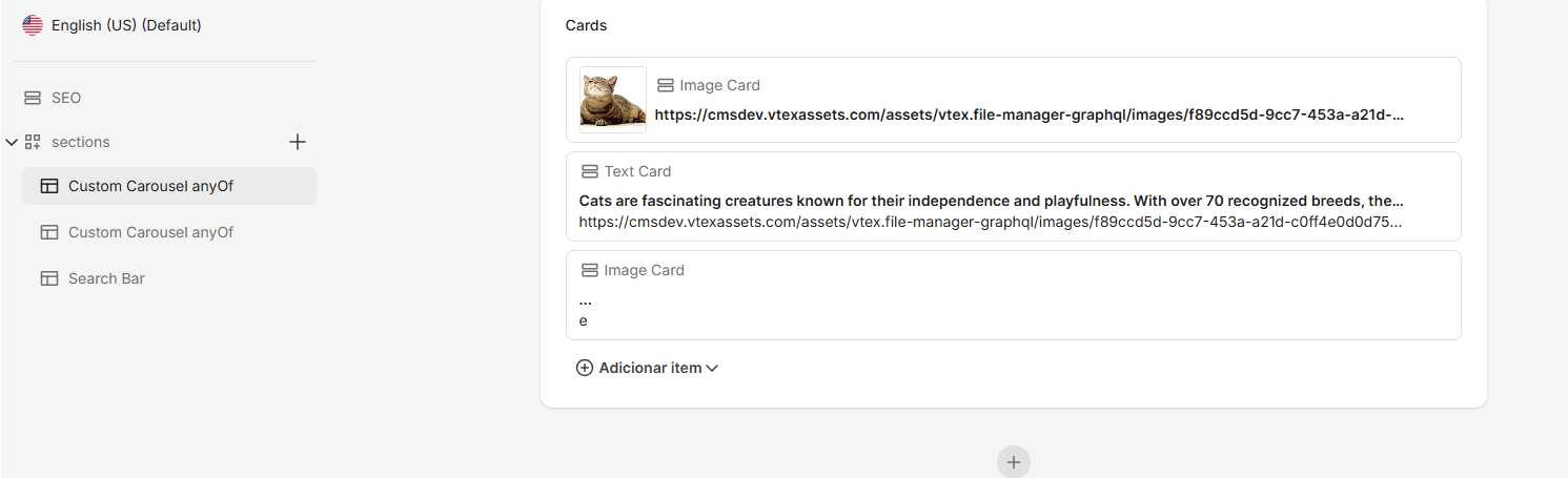
The image above shows the Custom Carousel anyOf section in the CMS Admin. The Cards array accepts Image Card and Text Card items in any order and combination.
What your storefront does: Iterates over the cards array and dispatches each item to the appropriate renderer based on which properties are present.
The examples above illustrate two different array contexts, not a rule about which keyword to use where.
anyOfandoneOfcan each appear on a single field or on array items. What changes the UI behavior is the array context: a single field renders a type picker, while an array renders a growable list with per-item type selection.
Making components available on pages
Components become editable page blocks when a Content Type references them through a sections property.
Opening the section picker to all components
Reference the generated $ALLOW_ALL_COMPONENTS definition:
_10// cms/pages/cms_content_type__landingPage.jsonc_10{_10 "properties": {_10 "sections": {_10 "title": "Page sections",_10 "$ref": "#/$defs/$ALLOW_ALL_COMPONENTS"_10 }_10 }_10}
Every component in your bundle (including CallToAction and PromoBanner) appears in the Admin section picker. Building blocks such as Link and SEO are meant to be embedded with $ref, not added as standalone sections. Mark them with $abstract: true to signal that intent to the Admin.
Restricting sections
When a Content Type should allow only certain sections, replace $ALLOW_ALL_COMPONENTS with an explicit anyOf list:
_11"sections": {_11 "title": "Page sections",_11 "type": "array",_11 "items": {_11 "anyOf": [_11 { "$ref": "#/components/CallToAction" },_11 { "$ref": "#/components/PromoBanner" },_11 { "$ref": "#/components/RichTextBlock" }_11 ]_11 }_11}
Use restricted lists on Content Types where commerce or promotional sections would not make sense, for example, blog posts or legal pages.
Reviewing the published component shape
After adding a CallToAction section to a landing page and publishing it, the Data Plane returns content shaped like this:
_15{_15 "componentKey": "landingPage",_15 "slug": "summer-sale",_15 "sections": [_15 {_15 "componentKey": "CallToAction",_15 "title": "Get 20% off your first order",_15 "link": {_15 "text": "Shop now",_15 "url": "/sale",_15 "linkTargetBlank": false_15 }_15 }_15 ]_15}
Each item in sections includes a componentKey your storefront uses to select a renderer. Nested objects from $ref (such as link) don't get their own top-level componentKey unless the schema defines them as embedded components at the Content Type level (as with SEO on a landing page).
Rendering components in headless storefronts
Your storefront owns the mapping from schema to UI:
- Fetch the entry from the Data Plane API by Content Type name or slug.
- Loop through
sections(or fixed component fields such as SEO). - Match
componentKeyto a component in your framework (React, Vue, Svelte, or server templates). - Pass field values as props or template context.
Unlike FastStore integrations, headless projects do not ship with a predefined component library. You define both the schemas in cms/components/ and the renderers in your codebase. Keep $componentKey values stable: Changing them breaks existing published content and storefront mappings.
For the full content lifecycle (schema upload, authoring, publishing, delivery), see Understanding CMS architecture and schema declarations.

